Engage your audience with the right brand event marketing strategy. Discover tips and tricks to create impactful events with QWERTYLABS.
+63 (02) 8971 8926

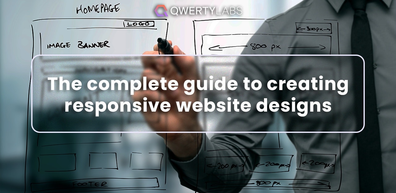
User experience can be the difference between converting site visitors or them bouncing off your site. This pressure is why companies invest in building responsive websites. This means optimising web design elements like your site layout to improve performance and create a more seamless user experience.
Let’s dive into all things responsive web design and how you can apply these to your site in this QWERTYLABS article. We’ll discuss responsive web design guidelines, principles and more so you can build more value into your sites.
Let’s first look at what exactly responsive web design means and what it entails. Learn about the concept, what goes into it and where you can see it in play.
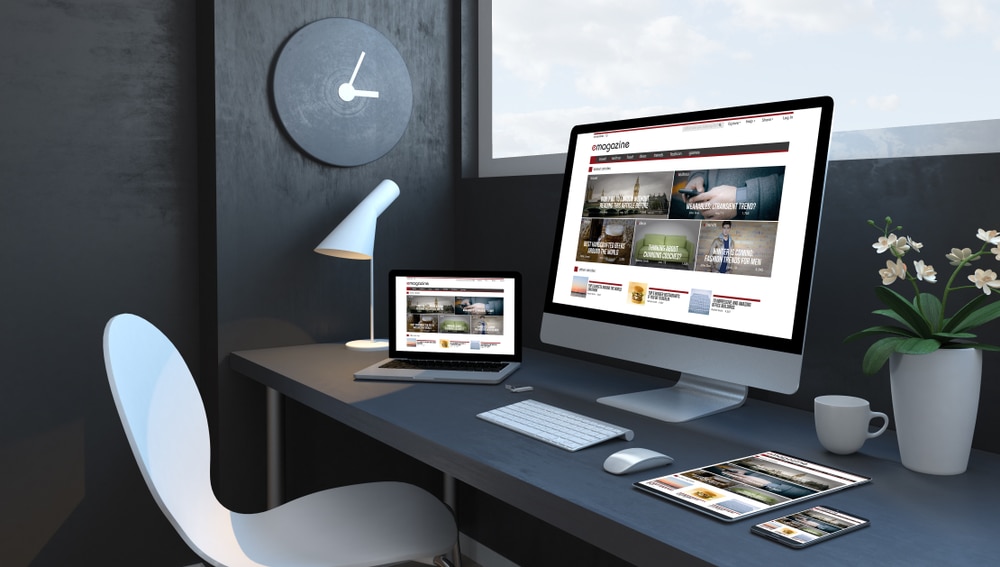
Responsive web design is the concept of creating websites that function and adapt across many devices. This ensures that content is displayed properly regardless of the screen size. It involves steps to ensure this and a series of tests to verify that your site can be accessed and navigated wherever you access it.
This concept first appeared in the early 2010s in reaction to the popularity of mobile devices and the necessity to deliver a uniform and user-friendly experience. Since then, web developers and companies have prioritised user experience for multiple devices, from tablets to smartphones and computers.
Responsive design incorporates several essential ideas and methodologies. It entails employing fluid grids, flexible graphics, and media queries in CSS to build layouts that can adapt to multiple screen sizes effortlessly. This means that whether you're using a desktop monitor, a tablet, or a smartphone to access a website, the information and design will automatically change to fit the screen, preserving readability and usefulness.
Responsive design is almost everywhere on the internet. Major news websites, e-commerce platforms and social media networks are some of the biggest examples of sites using responsive design.
When you visit these sites on a desktop and a mobile device, you'll see how the layout adjusts and rearranges to match the unique screen size, making it simpler for visitors to explore and engage with the information.
Responsive web design is used across a wide range of websites, and its application is particularly noticeable in media-sharing platforms, informational sites and e-commerce websites.
Media-sharing platforms like YouTube and Instagram also utilise responsive design to ensure that videos, images, and user-generated content adapt seamlessly to various screen sizes. Doing this offers viewers an optimal viewing experience on desktops and mobile devices.
On the other hand, informational sites, like news outlets and blogs, benefit from responsive design by making articles and content easily readable and accessible on smartphones and tablets.
Lastly, we have E-commerce websites like Amazon that use responsive design so users can shop and make purchases conveniently, regardless of their device. This makes it extremely convenient for Amazon users to shop on the go and still have an optimal online shopping experience.

To make the experience universal, there are principles, design guidelines and metrics that act as standards for responsive web design. These ensure that elements in your web design, like the user interface, user layout and screen space, work harmoniously.
Discover these 3 major web design principles and what they all contribute to web design.
Fluid grid systems develop adaptive layouts that perform smoothly across multiple screen sizes and devices. Instead of fixed-width layouts, these establish column widths and element spacing using relative units such as percentages.
Because of this flexibility, content resizes to fit the available screen space while maintaining readability and visual harmony. Fluid grids enable websites to scale from desktop screens to tablets and smartphones easily while keeping a consistent user experience.
After establishing the grid system, content such as media forms and text comes next. Here’s where the concept of fluid image use comes in. This entails optimising and resizing images to accommodate different screen sizes and resolutions. Images are scaled using relative measures such as percentages rather than set dimensions.
As a result, the pictures automatically alter their proportions to match the available space on various screens, avoiding problems like pixelation or large images being displayed.
The last of the three foundations are media queries. These allow websites to adjust to changing device attributes like screen width, height and orientation.
Let’s say a particular criterion is satisfied. These queries are then placed in the website's CSS code and activated in various styles. Designers can then construct layouts and components that change to different screen sizes dynamically. This leaves users with a consistent and user-friendly experience across devices.
Now, let’s look at responsive web design best practices you need to do from planning to execution. See the step-by-step guide on what you should do before development. From thinking about the content to CSS and to listening to user responses, let’s dive into what you should consider.
Prioritising information is critical in responsive web design since it’s essentially what users are coming onto the site for. This, first and foremost, guarantees that you satisfy the user’s inquiry, which is a great start for a user-centric experience.
To prioritise this, designers first need to identify crucial content pieces. This eliminates clutter and optimises readability. Once the content has been established, designers can proceed to construct layouts that adapt seamlessly to multiple screen sizes.
It’s important to note that content-focused planning also influences font, picture selection, and even information hierarchy selections. This then influences user engagement and satisfaction.
When you understand media queries, you can target style and layout alterations based on the user’s device attributes. Designers may use media queries to specify where the design should be altered to meet multiple screen sizes, resolutions and orientations.
By understanding media queries, they can build a smooth and aesthetically attractive user experience. Subsequently, the website's information remains accessible, legible and functioning regardless of the viewing context.
Mobile users make up a good portion of web traffic, which is why designing responsive web design requires a mobile-first attitude. By starting with the constraints of small screens and little bandwidth, designers are led to focus on critical information and efficient functioning. This ensures that the website is user-centric, optimised for speed, and capable of offering an engaging user experience across all devices.
Making your site accessible means considering how to make the user experience of people with disabilities a lot easier. Getting information for them should be more convenient and quicker than usual. However, accessibility has to be planned from the beginning and implemented smartly to be effective.
When accessibility features are built in from the start, they effortlessly adjust to different screen sizes and devices, providing all users with a uniform and inclusive experience. Designers provide the groundwork for a responsive design that is visually adaptive and useful for a broad audience by addressing accessibility in the planning process.
Some accessibility considerations include high-contrast lightning, keyboard navigation, screen reader compatibility and clear, well-structured information. Include them in your design planning to reach a wider audience.
Website speed and performance optimisation ensure faster loading times and seamless user interactions. Optimising code, graphics, and content decreases page load times in a multi-device scenario where consumers have variable internet connections and hardware capabilities.
Efficient performance is critical to responsive design for two reasons: making information easy to find and reducing bounce rates. This then boosts user experience and satisfaction, particularly on devices with limited bandwidth and processing capacity.
These two steps lend crucial insights into user behaviour and preferences. Designers can then use these in developing sites, specialising them based on their target audience and how they use them.
Going into more detail, user personas allow designers to empathise with their target audience and adapt responsive features to fit unique user demands. On the other hand, user testing verifies design decisions by identifying usability issues on different screens and driving revisions.
This data-driven approach guarantees that the responsive design meets real-world user expectations, optimising the user experience.
Think of the smallest screens on mobile devices across the market. These will probably be smartphones created in the last 5 years. What makes starting with smaller screens ideal is that you can optimise the website code for one point of the spectrum that many people use, setting a foundation for the leaner code, smaller image sizes and faster loading times.
This entails organising and structuring material to efficiently lead user attention, especially when adapting to multiple screen sizes. On bigger displays, larger headlines and vivid images can be quickly seen. However, smaller screens prioritise vital material with crisp fonts and fewer distractions. This allows users to easily identify critical information, which improves overall usability depending on where the user is accessing the site.
This best practice involves developing navigation menus and interactive features to be user-friendly and accessible across multiple devices and screen sizes.
Creating logical menu layouts, touch-friendly buttons, and direct calls to action are all part of this. Doing all these results in improved usability, decreased visitor irritation and increased user engagement, adding value to the user’s experience.
Using flexible typography in web design responsiveness involves designing text elements to adapt smoothly to different screen sizes and resolutions. To do this, set font sizes and line heights using relative units (like percentages or ems) instead of fixed pixels.
Additionally, employing CSS media queries allows for adjusting typography styles based on the viewport's dimensions. For instance, on smaller screens, fonts may scale down to ensure readability, while on larger screens, they can scale up for improved legibility. This responsive approach ensures that text remains comfortably readable and aesthetically pleasing across various devices and screen sizes.
Taking touch-and-click use into account in web design responsiveness implies knowing where to put interactive components like buttons, links, and menus on the site. This may seem simple at first, but you’ll have to understand what people click on, where they normally tap and what elements of the site are most likely to be interacted with and why.
Therefore, understanding touch-and-click usage, like where users are most likely to click to advance the page, makes it easier for developers to create navigable sites.
Remember that links and other intractable elements must be large enough to be tapped with a finger without causing inadvertent clicks. This is also true for mice and clicks as hover effects are substituted with touch-friendly interactions.
After much planning and responsive website development comes the testing phase, where much of the user experience, response and issues are recorded for the site’s further improvement. This section briefly covers how to test responsive web design for both computer and mobile devices.
This involves assessing a website's operation and appearance across browsers and versions. This is a critical step since various browsers understand and render code differently. Through this test, you can assess how the website works across a broad range of browsers.
It guarantees that a website works consistently and appears aesthetically attractive regardless of whether people access it on Chrome, Firefox, Safari, Edge or a different browser. Without this testing, a website can seem broken, have layout flaws or lack functions. This can result in a bad user experience and higher potential customer turnover.
This test requires enlarging the browser window manually or using development tools to imitate multiple screen sizes and orientations, such as those seen on mobile devices or bigger displays. It ensures that websites adapt elegantly to different viewport dimensions.
Through this test, designers can detect and resolve layout errors, content overflow and design features that fail at different screen sizes. They can then create a smooth and aesthetically appealing user experience on all devices.
In this test, designers move between portrait and landscape modes on mobile devices. This is necessary since these devices are more portable and can be used while sitting, lounging, standing, etc. Your website should still be usable despite these abrupt changes. To recreate these scenarios, emulating device orientation and testing for it is necessary.
By testing how the layout and content adjust to both, designers may guarantee that the website stays functional and aesthetically appealing. Orientation changes can affect the layout of items, text legibility, and overall user experience as it fits their current position better.
With these tools, designers immediately recreate the experience of browsing a website on various mobile devices and screen sizes within a desktop browser. They can then identify layout, typography, and visual flaws that may appear differently on mobile displays. Consequently, designers can fine-tune their designs and ensure that information legibility and user interactions are seamless.
Doing responsive web design best practices is no mere walk in the park. For a site to be responsive and effective, it takes a lot of knowledge of web development concepts and a full understanding of the website development process.
That’s why QWERTYLABS wants to help you make the whole website design process seamless and easy. We offer extensive design optimisation services and even smart content creation for your brand, so you won’t have to worry if your message is reaching the right people.
Contact us to discuss how our partnership can boost your casino’s overall performance.
Responsive web design is a method of developing websites that prioritises the user experience by adjusting and optimising its appearance, content, and functionality across several devices.
You can achieve this adaptability by using techniques such as fluid grids, media queries, and flexible pictures. This then allows the content to resize and rearrange dynamically to suit the user's viewport and device characteristics.
A responsive website uses fluid grids, flexible images, and media queries to adapt to multiple screen sizes and devices in its design and development.
Content should scale proportionally, whereas flexible graphics should resize without distortion. Finally, media queries should employ different styles depending on the user's device.
To build a responsive website, begin with a mobile-first strategy, planning for tiny devices first and gradually expanding to bigger ones. Prioritise content hierarchy, optimise fonts and ensure the website navigation is touch-friendly.
Finally, test and debug your design on a variety of devices and browsers regularly, with an emphasis on performance optimisation.
Responsive web design is important because it considers user satisfaction through different scenarios and user conditions. An example of this is designing for better accessibility, specifically for people with impaired vision or mobility. Another example to take into consideration is accessing the website on the go, whether in landscape or portrait mode.
The best method to ensure responsive design is to do rigorous testing and listen for any issues or complaints. A good way to achieve this is to test your design before launching the website. Utilise assistive technology, undertake usability testing with people with impairments and guarantee seamless keyboard navigation.
 A guide to proper brand event marketing to elevate your business
Engage your audience with the right brand event marketing strategy. Discover tips and tricks to create impactful events with QWERTYLABS.
 Cybersecurity trends 2024: What online casinos should know
Stay on top of your site's cyber security by learning trends like Zero Trust Security and Supply Chain Attacks. Learn more about it at QWERTYLABS.
 The latest Google search algorithm updates for SEO success
In 2024, Google remains the top choice for finding answers online. That’s why it continuously refines its search policies and algorithms to improve user experience (UX) and provide more accurate search results.
8F, One Trium Tower,
Filinvest Avenue, Alabang, Muntinlupa, Metro Manila
Philippines, 1799
[email protected]
+63 (02) 8971 8926