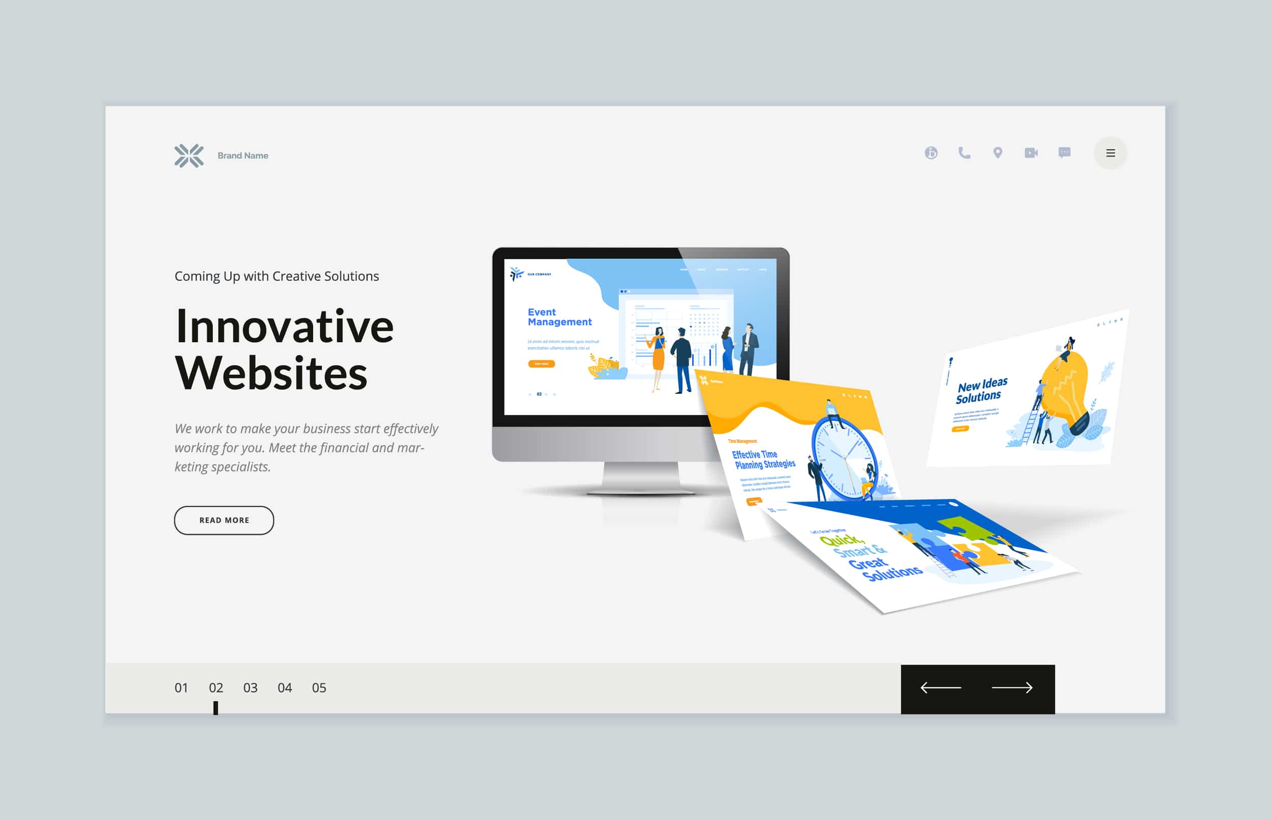
Designing a website can be daunting especially for people without a lot of experience. Most of them tend to add unnecessary elements to their sites that make the website’s goal unclear. Aside from your company’s information and services, the main focus of your website should be capturing leads.
What is lead generation?
Any person who shows interest in your company is a lead. The end goal is to convert all of your leads into customers or clients. How do we do that? We make lead generation materials and, in this case, it’s a website.
The design and layout of a website is crucial in catching the attention of your visitors and making them do what you want them to. Curated below are the 5 most important design elements you need to consider when designing your website to capture leads:
1. Prioritize a good UX
User experience or UX is a design principle that focuses on how the user interacts with your product or service. In a website, you should always prioritize how easy it is to navigate and use. This includes sections and website navigation. A visitor will most likely stay and explore your website if it is easy to navigate and can end up becoming a lead.
2. Add a prominent CTA
Call to action or CTA is a prompt that encourages a user to make an action. The CTA of your website should be the main goal to generate leads. Common examples of CTAs that you can use are ‘Download Now’, ‘Subscribe Now’ or ‘Contact us’.
To generate leads, you have to make sure that the CTA is prominent and in an easily accessible part of the website. It is usually added in the hero banner of the homepage.
3. Avoid block of texts
A common mistake in designing websites is adding a lot of text in blocks. This is often done as an SEO strategy to insert more keywords and rank higher in search engine results. Unfortunately, this is not a good look for users that visit your website.
One great strategy is to divide the content into possible visual sections like columns. You can also insert engaging visual elements in between text blocks like images, videos, and infographics.
4. Include client testimonials
A good way to build user trust and loyalty is to have testimonials on your website, especially in the homepage. Aside from knowing that there are already existing customers who trust your company, testimonials also help further explain your products or services. It is also a lot easier for other people to connect with existing customers than the people behind the company.
5. Optimize your website for mobile
Most of the time, people tend to search online using their mobile phone according to a recent survey that indicated 54.8% of the global website traffic comes from mobile devices. This means that users will most likely visit your website using their phone. Having an optimized website for mobiles will impact your chances of generating leads.
There are several design frameworks that work well with mobile phones so it means you have a lot of options to choose from.


