Your company website needs to show what your business is to current and potential customers. In short, it needs to be effective so that you'll know customers understand how your business would help them. You need a solid modern website to show your business's strengths.
Think of your website as a store with glass window sills and shelves. Only this time, it's virtual. Your site design should then be good enough to attract visitors and see what you're selling.
What do you need to consider when creating an effective site design for your business? We at QWERTYlabs, have experience developing solid platforms for different brands and businesses. Here are the crucial design elements we always consider when building a website:
- Easy navigation and the user experience
Websites need to drive traffic to your business. It can be your primary marketing tool to get your brand out there, which is why your site visitors need a clean experience.
Buttons or links should be clear and easy to spot
Buttons help you navigate the website correctly. Always remember that site users should know how to jump from one page to another and go back to their visited pages. Don’t let them get lost in a sea of URLs on your website.
You should also know the importance of each link. By understanding the priority of each link, you will learn how to design each. The most important links, or the ones you want visitors to click on, must be catchy. It means a different colour scheme highlighting the link and the perfect placement so visitors can see it immediately.
Contained buttons are great for calls to action on your website. The ‘contained button’ design includes a bright colour in contrast to the text. You’re more drawn to it because it catches your eye and has more weight.
You can also use the ‘outlined button’ design for calls to action without contrasting colours and text. Try out other options because toggle buttons are helpful when you use them properly, like switching from light to dark mode.
Your page navigations should be a clear map for users
To ensure your website is well-designed like ours at QWERTYlabs, it needs separate pages such as the Home, About Us, and even its blog section. If there is a topic you want to discuss, make a page dedicated to it. It also makes sense for the aesthetic side of your website because it will look much more organised.
- Striking visuals
Do you want to keep customers coming back to your site? Make sure to invest in striking visuals. Visual content is the primary tool to capture people’s attention nowadays. Use it to engage with your audience and to keep their attention on your platform. First impressions will matter; if you entice people with your visuals, it will be easier moving forward.
Unique typography
Choosing a consistent font style can make your website look professional. Most websites will use the usual choices like Times New Roman or Arial. Websites can hire designers that can create unique fonts and typefaces, which can also help you stand out because you’re not conforming to popular design trends.
Engaging images and videos
Apart from unique fonts, images should fit the overall theme of your site. These images will be crucial to how your website will appeal to the customer because if you use a less-striking picture, that will not resonate with the visitor.
You can also separate your website from the rest of the pack because you can have unique images uniquely linked to your business. Convey a message using imagery, and it can build your brand better.
You can also embed videos on websites, making it easy to show some of your business's biggest strengths. A video effectively tells your business's story since it suits your visitors' attention span well and can tell it engagingly.
- Content hierarchy
As you design your website, you should be strategic with what you want to show. For example, the QWERTYlabs website offers the brands we’ve worked with and are working with, but we want to connect with more brands.
You can immediately see the ‘Let’s start together’ button so visitors can contact us directly if they want to inquire about our services. When it comes to content hierarchy, you should know the top priorities of your business before you create a web design.
- Prominent calls to action
Do you want to entice your website visitors to check out your business? You can include some buttons or pop-ups to help your visitors contact you quickly, or they can see what you offer. Your website should have calls to action.
Like what you can see on the QWERTYlabs homepage, you can contact us immediately with the big green button in the middle of the page. Another CTA that stands out on our platform is the Get in touch button on the top right corner, which can lead you to an inquiry page.
- Smart use of whitespace
Minimalist design is the norm for websites now because it looks better, is easier to navigate, and is the optimal way to consume the content on the site itself. With intelligent use of whitespace, your website will not look too congested. It is present on our website, where every element has proper spacing.
It will be wrong to squeeze all of your content into one page because that will slow down the page, and it will not look good because of the various elements present. By knowing the principles behind the proper use of whitespace, your website will have visual breathing room for the visitors, and it will not be too overwhelming.
- Website visibility
Apart from the aesthetic side, you should also ensure that your website will be visible to people who have not yet visited it. You can do this through advertisements on social media that can entice people to visit the website.
The site should be optimised for search engines
Your content should be engaging to the point that it can appear on search engines. Search engine optimisation is essential because it drives traffic to your website. To optimise your site to be found on Google, you must tick all boxes by knowing your audience, catering to them, and adhering to the online space.
By creating your content, you should research the effective keywords to make your website visible on search engines. Use these keywords in the content you’re putting out so that when they search them on Google, the top search results will include your website.
Make sure you’re also designing valuable and content-rich pages for your website because that will also help it rank higher on search engines like Google. Optimise them by adding keywords into the headings and body but do not make it too stacked with keywords because it can look unnatural.
Create optimised versions for mobile use
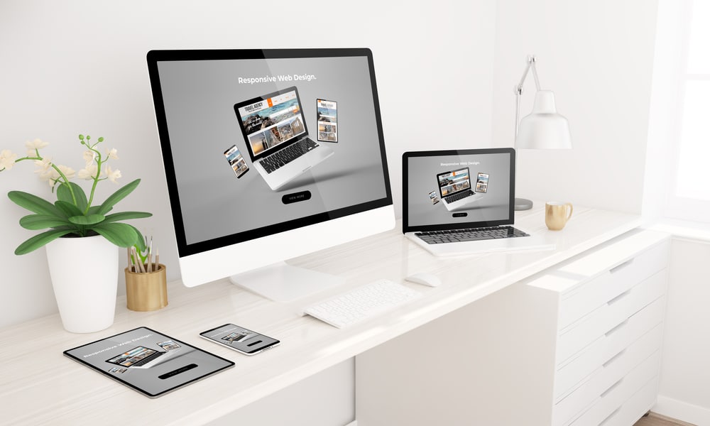
Creating a mobile version is crucial for your business website because some people do not have the time to open their computers to check out the site.
You might encounter some sites that are too zoomed in or zoomed out when using mobile browsers. Change the settings to be viewable on mobile by tinkering with the Viewable Area setting by putting it around 0-980px, so it fits any device, just like the QWERTYlabs website.
Good website design can take you far
Businesses thrive with a well-designed website, so if you need a complete site build or a quick touch-up of your website design, you can use the elements above or let QWERTYlabs help you. Contact us now, so you have the best website for your brand.


